Intro to Seaborn
On Mon Jan 23 2023
Introduction & Set-up
Seaborn aims to help us developers/data analysts plot data in a less painful way compared to matplotlib, which you probably have used a lot earlier. This post was created to benefit people who want a quick introduction into the package. If you have prior knowledge in matlab or matplotlib you will probably have no issues with understanding what is going on. And as always, remember that there exists documentation so if you have questions or wonder about a specific method you can take a look there.
Importing
We will import seaborn as well as a dataset to use for plotting.
import seaborn as sns
import pandas as pd
iris_url = 'https://raw.githubusercontent.com/dotpyu/seaborn-datasets/master/iris.csv'
iris = pd.read_csv(iris_url)
titanic_url = 'https://raw.githubusercontent.com/dotpyu/seaborn-datasets/master/titanic.csv'
titanic = pd.read_csv(titanic_url)
Plot Showcase
We will now take a look at a couple of different plots you can create with seaborn.
Scatterplot
Scatterplot is incredibly easy so we will start of with that.
sns.scatterplot(x='sepal_length', y='sepal_width', data=iris)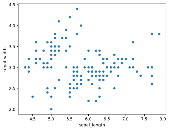
Everything here is fairly self explanatory. To continue, we can specify even more parameters like this (with or without the palette, it can be left out for the preset):
mapping = {
  'setosa': 'red',
  'versicolor': 'blue',
  'virginica': 'green'
  }
sns.scatterplot(x='sepal_length', y='sepal_width', data=iris, hue='species', palette=mapping)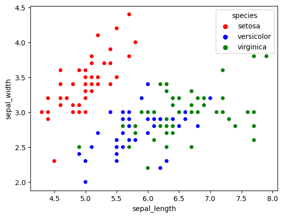
Great! We can change the colors as we please and it was incredibly easy. Now how do we change other highly common things like position of the legend (the box that says ‘species’ etc.) and the shape and size of the dots?
To start with, let us look at changing shape and size as this is just more parameters.
mapping = {
  'setosa': 'violet',
  'versicolor': 'orange',
  'virginica': 'lime'
  }
sns.scatterplot(x='sepal_length', y='sepal_width', data=iris, hue='species', palette=mapping, style='species', size='species')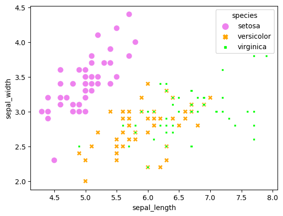
An interesting thing here is that size and style both have additional parameters changing their behaviour. They are called ‘size_order’ and ‘style_order’. By setting these you can change precisely what they are called, avoiding the auto-generated size levels and styles.
Legend placement
Changing the placement is slightly more involved, but still easy to do. All we have to do is store the output of the scatterplot function and then change the placement afterwards.
scatterplot = sns.scatterplot(x='sepal_length', y='sepal_width', data=iris, hue='species', style='species', size='species')
sns.move_legend(scatterplot, "lower right") # Options are upper, lower, center, left and right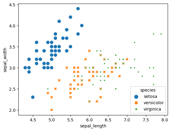
Now you may be wondering how we can move the legend outside of the plot, I certainly did. Unfortunately it will probably require some tinkering to get it where you want, but if you are using something like a jupyter notebook it will be easy to just rerun and change. What you have to do is use the parameter ‘bbox_to_anchor’. Understanding how it works can be confusing at first but by testing it a couple of times you will figure it out. When you play with it I recommend trying out using ‘0,0’ and ‘1,1’. Also, in my mind it is easier to use ‘lower left’ as location but you may think otherwise.
mapping = {
  'setosa': 'violet',
  'versicolor': 'orange',
  'virginica': 'lime'
  }
scatterplot = sns.scatterplot(x='sepal_length', y='sepal_width', data=iris, hue='species', palette=mapping, style='species', size='species')
sns.move_legend(scatterplot, "lower left", bbox_to_anchor=(1, 0))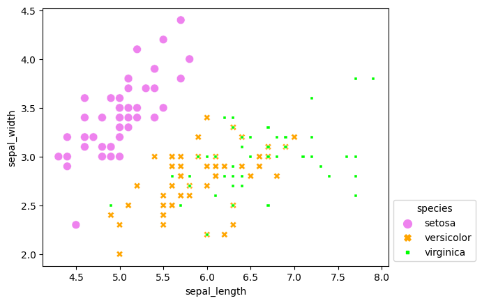
Histogram
Next up are histograms, which are available with ‘histplot’. These can get confusing by adding colors, but if you need them they are available. Note that unlike scatterplots these cannot have ‘style’ or ‘size’.
sns.histplot(x='sepal_length', data=iris)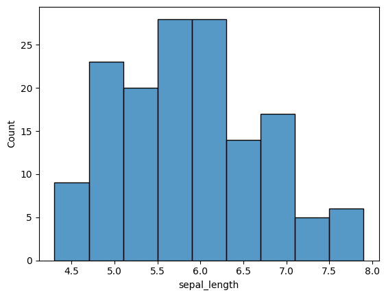
The only other thing I want to show you about histograms is the kernel density estimate option. It may sound scary but it is simple. Take a look!
sns.histplot(x='sepal_length', data=iris, kde=True)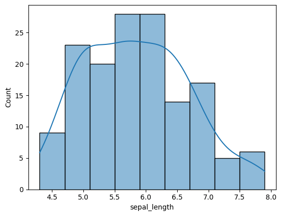
Heatmap
Heatmaps are great for finding correlations within data as you will see shortly. The parameter ‘annot’ just means that the individual boxes contain the correlation value.
sns.heatmap(iris.corr(numeric_only=True), annot=True)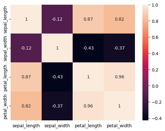
Compared to interpreting the table of data that we usually get this is way easier to understand. Here is another example of it:
sns.heatmap(titanic.corr(numeric_only=True), annot=True, cmap='coolwarm')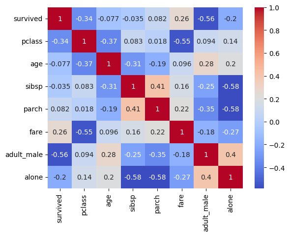
Conclusion
There are a lot of options for plotting data when using seaborn. As I cannot show all types in a single blog post go to their API page and take a look at all the possible plots you can create. I have avoided the more complex ones because I wanted to make this short. I hope you found something interesting within this post or at least found out about this very interesting library.
Have a good day!